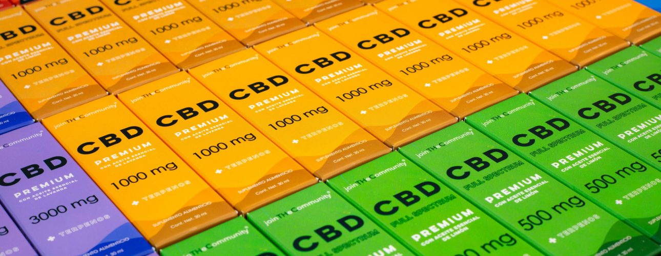
Picture this: a customer walks into a dispensary. Rows of products, all shouting for attention. What makes them stop, reach out, and choose yours? It’s not the bud inside—not yet. It’s the packaging.
In the cannabis world, where trust, education, and compliance are just as important as aesthetics, your packaging does more than hold the product. It tells a story. And when done right, it whispers one thing to the customer: “pick me.”
So, how do you design cannabis packaging that turns heads and opens wallets? Let’s dive in.
Start With the Basics: Compliance
Before you unleash your inner Picasso, remember: in cannabis, creativity must play nice with compliance. Different regions have different rules, and ignoring them isn’t an option. Here’s a quick checklist:
- Include required warning labels and regulatory symbols.
- Ensure text size and placement meet legal standards.
- Avoid misleading claims or imagery.
Think of compliance as the frame around your masterpiece. It sets boundaries but still leaves plenty of room to shine.
Design for Your Audience
Who’s buying your product? First-time users looking for guidance? Connoisseurs seeking premium quality? The soccer mom curious about CBD?
Great packaging doesn’t just look good; it speaks directly to the person holding it. Use colors, fonts, and visuals that resonate with your target customer. A sleek, minimalist design might scream “premium,” while vibrant, playful packaging might appeal to a more casual crowd.
Tell a Story
People don’t just buy products; they buy stories. What’s yours?
Is your cannabis sustainably grown? Local? Hand-trimmed? Your packaging is a blank canvas for sharing what makes you special. A QR code linking to a behind-the-scenes video or a small blurb about your growing practices can turn casual interest into loyalty.
Prioritize Functionality
Beautiful packaging that’s hard to open? No thanks. Child-resistant features that frustrate adults? Even worse.
Your design should balance aesthetics with ease of use. Think resealable pouches, clear labeling, and materials that protect product freshness. Functionality isn’t just practical; it shows you care about the customer experience.
Stand Out, But Stay Authentic
It’s tempting to go wild with your design—to slap on neon colors or an outlandish logo. But standing out doesn’t mean being loud. It means being authentic.
Look at what’s already on the shelves. How can you be different in a way that feels true to your brand? Maybe it’s using eco-friendly materials. Maybe it’s a clean, minimalist design in an industry full of flashy graphics. Whatever it is, make it yours.
A Few Tips to Nail the Details
- Typography Matters: Choose fonts that are readable but also convey your brand’s personality. Bold and modern? Handwritten and artisanal? It all tells a story.
- Color Psychology: Green says natural. Gold says premium. Black says sophisticated. Use color to subtly communicate your product’s value.
- Texture and Finish: Matte finishes, embossed logos, or soft-touch packaging can elevate your design and make it feel premium.
Why Packaging Is More Than a Box
Packaging isn’t just a container; it’s a conversation. It’s the first impression, the reassurance, and sometimes the deciding factor between your product and the competition. When done right, it doesn’t just get your product noticed—it gets it remembered.
So, ask yourself: does your packaging do more than hold the product? Does it invite curiosity, tell your story, and make the customer feel something? If not, it’s time to redesign.
In a crowded marketplace, packaging isn’t a cost. It’s an investment in your brand. Make it count.

